I thought you might be interested in my process while I made a medallion top. The top is a sample I developed for the Medallion Sew-Along. A key aspect of the sew-along is that I invite you to design as you go. There is no pattern prescribing what border to use. I provide a lot of examples and ideas. You take it from there.
But design-as-you-go can seem mysterious to those who’ve never worked that way. So I’ll step through this example and talk about the decisions I made, and my assessment of success or failure on them. I’d love to hear your opinions, too, both positive and negative ones. This is how we learn.
I started by making a 15″ center block.
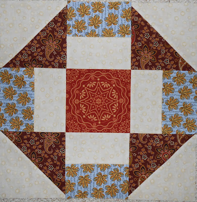
I love the medallion print in the middle patch, and I like the interplay of blue and browns. The cream background is one I’ve used in a number of “important” quilts. It’s almost gone and I’ll miss it. The churndash pattern is a favorite of mine. Overall the block works with good color and value contrast, and good balance.
I decided to turn the block on point. I had a solid blue of the same color as the blue print used above. You can see here I’ve pinned the first setting triangle in place. (Lots of thin pins to hold the bias edges without stretching!)

Once the four corners were sewn on, they seemed too strong, too vivid. And other than the strength of color, they weren’t very interesting. So I built NEW corners, trimmed the blue, and attached.
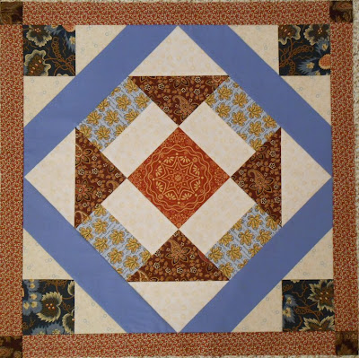
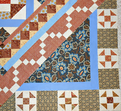
Then I framed with rusty brown to take the center to 24″. This works well for the most part. I still think the solid blue strips are slightly too wide proportionally. But for me, the worst part is that I lost the look of the churndash. Once turned on point, it’s an interesting block. But it’s not a churndash.
The color set for the quilt was established at this point. Rusty brown, brown, cream, pale blue, and navy. There was a little gold in the blue print and in the brown paisley, but not much. In retrospect, the limited color palette makes the finished quilt top a little dull. Any great ideas about what accents could have helped? I’m still not sure what would have given it more spark.
The next border is from 4″ hourglass units. I’ve used this on a few other quilts, more successfully than here.

There are two different brown prints in the hourglasses, but the colors/values are too similar. They needed more contrast. On the other hand, the browns balance the vivid blue well. I do like the pale blue print brought out again. I only had a fat quarter of it. It needed to do a lot, for such a small amount of fabric. I also like the repetition of squares on point, echoing the center block.
The next border set included a 2″ spacer and a 6″ pieced border, taking the top to 48″.

The blue 2″ border is actually a different fabric than the prior solid blue, and it has a fine pattern on it. I made the 6″ border harder than it should have been, as you can tell in my post AaarrRRGH!!! Once that got straightened out, it too echoes the squares-on-point impression, though the patches are straight-set, not on-point. I like the lacy effect of the combination of cream patches and the particular rust print.
And still I wanted to turn the center block again, taking the churndash back to its original orientation.
Doing so would require large setting triangles. I’ve used them before on these two quilts:

Wedding quilt, 2013
Quilt for Jim, 2012
On the first one, the setting triangles are not pieced. On the second one, they are.
I wanted pieced triangles for this project, to actually build borders in the triangles.
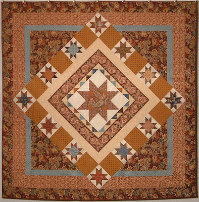
Setting the 48″ top on point would take it to almost 68″. The setting triangles needed to be at least 35″ (approximation — ask me if you want to see the math) to be large enough. I have much better success when I make setting triangles oversized. I decided to create triangles that would finish 36″ on each side. That allows for six 6″ blocks around the edges. The end blocks actually were “half” blocks, and needed excess to give room for trimming diagonally.
 Shoofly blocks are the plain cousins of churndashes. They are simpler. Using them in the border allowed the emphasis of the churndash shape, without distracting complexity.
I drew up my idea on graph paper, and then tested it with some of the millions of 6″ churndashes I’d made (and not used) for another quilt. They didn’t work for the other because they are too fussy. But they gave me an idea of what it would look like with shooflies.

I wondered about the difference between using unpieced spacer blocks or 9-patches.

Pieced blocks looked richer, but still subtle.
Using triangles built like this would make them oversized. The 48″ square would “float” on them. See how the point (rust with cream patches) floats on the 9-patch pieces?

After attaching the triangles, the top needed to be framed. The frames enclose the rest, and repeat the beautiful navy print, giving unity to the whole.

The completed top is 85.5″ square.
Thanks for taking a few minutes to read. I’d love to hear your comments, thoughts, questions, critiques.

Your wedding quilt 2013 turned out so pretty! I love blues and browns together.
I got my medallion top done! More on that here http://myall2.blogspot.com/2013/11/quilts.html
Let me know if you run another challenge! 😀 So happy to have come this far on this project for dear hubby.
Oh, Kathy, It’s WONDERFUL! I told you I’d link to it, and I will in the morning. I was out of town for a funeral, and I came back with a cold. blech… But I should be functional enough when I am “fresh” to manage that.
Thanks so much for sharing your work. It turned out great!
mjm
I love the colors of the blue – and the churndash block. The blue is outstanding in the block. Good blog.
Thanks, and thanks for taking a look!
Thanks for giving us the “what I was thinking” perspective on your medallion. I think you did a good analysis of the outcome of each step. Looking at the finished top, I wonder what the effect would have been of keeping the solid blue triangles near the center. And more contrast in the brown HSTs (or possibly using the rust fabric of the center square) would have added zing. The blue print of the outer border really ties the top together and echoes that fabric’s use elsewhere. But that’s why it’s fun to work in series to try all those what-ifs.
I have to admit I hoped you would comment. You have such a great eye and a good way of describing your thoughts. There is a lot I like about this project. If I’m disappointed at all, I just think it is a little dull, color-wise. BUT I’ve also shifted and realize I need to use brighter colors generally, so that may be part of that shift. (Is it older eyes? We need brighter to provide same effect?? ugh…)
Thanks so much for taking a look and giving some feedback. I really appreciate it.
Talk about irony! I’m trying to tone down the colors I use, or at least be a bit subtler. It’s only in the past few years I’ve owned any brown fabric.
This turns out so well. I love the process of creating medallions as well. Just beautiful. Thanks for sharing all your design thoughts.
Thanks! It was fun. I love making one decision at a time, too.
I enjoyed reading (and seeing) how you made the design decisions. Each round adds to the visul complexity — the result is stunning! Thank you for sharing the process.
You’re so welcome. Thanks for reading through. I know it’s kind of a long post, more than many people would wish to slog through.
Melanie, your progress through your Medallion Sew-Along was like a good book! I couldn’t wait for the end to learn the results. What a wonderful beautiful challenge. This gave me lots of inspiration! Thanks.
Thanks so much, Dee! It felt a lot like writing a book, too. A mystery, I guess!
Thanks.
I really enjoy seeing the steps of your design process. In the end you pulled everything together with wonderful unity and variety. I needed to switch to other projects and leave my medallion hanging, but your posts inspire me to keep thinking about it until I can get back to it.
I’d love to see yours, done or in process! Thanks for taking a look today.
I simply love it Melanie. The quilt looks truly fabulous. I particularly love the use of brown and blue, a favourite combination of colour for me and all the fabrics you picket throughout truly complement the centre block fabrics. Well done!
Linda Woloshyn
Thanks, Linda! I’m pretty happy with how it turned out.
Love it. Isn’t it great to meet a challenge with success? Well done Melanie.
Thanks so much!
It’s been interesting to watch you finesse this one into a finished quilt top. I think it forced you to work pretty hard. I like how it ended up. 🙂
I like it, too. And yes, I did work pretty hard on it. It wasn’t always obvious what to do next. Thanks.