Some quilts decide to be made, regardless of our intentions. Such was the case for Black Sheep Manor. This is a quilt I would not have made, if not for seeing a panel print earlier this year at a local quilt shop. The full panel had 15 small panel motifs with a country estate theme. The faux-crackled, tea-stained background with black print featured a sheep, two manor houses, a squirrel, two trees, and other assorted illustrations. This is not my typical style.
But Jim and I have friends, smart, funny, warm people, who’ve recently moved to a home they call their “Black Sheep Manor.” When I saw the black sheep on the panel, I had to get it. The quilt called to be made.

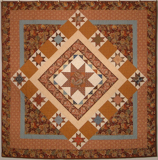
The Center Block
The black sheep had to center the quilt, but the small panel finishes at 7″. The size is better suited for a pillow or placemat than the focal point of a lap quilt. I’ve written before about enlarging center blocks with frames of various types. Adding variable star points doubles the size, and making a star-in-a-star quadruples it. But as much as I like stars, this little sheep called for something else.
To highlight and enlarge the sheep without other distractions, I chose to set it with an economy block setting. The simplicity draws the eye to the middle. Using strong value contrast with the subtlety of tone-on-tone prints emphasizes the block structure, as well.

The pattern design on the brick-colored fabric is of wheat stalks, and the pinky-tan setting triangles are printed with a deer motif. Both suit the small-farm life of our friends. These two fabrics, along with the sheep panel, set the theme for the rest of the quilt.
The Inner Borders
Beyond the economy center block, the first border of half-square triangles bursts forth to further enlarge the appearance. Here again, simplicity serves the purpose of enhancement rather than distraction. I did try a different arrangement of HST using two borders, and the effect was messy. As Jim reminded me, KISS is often the best policy. 🙂
The darker rust print edge around the HST finished the look of the center. Rather than the center appearing as a 7″ square, it is 22.5″.
The Middle Borders
Outside of the narrow rust strip is the second most important piece of the quilt. Though the sheep literally plays center stage, the wording personalizes it. Anyone could like black sheep, but there is only one Black Sheep Manor. The wording is hand-lettered using fabric markers. I printed the words on paper and then arranged a light box with an overturned plastic tub on top of a CFL utility light. I taped the paper to the plastic tub. Freezer paper on the back of the fabric stabilized it, and I taped that down, as well. I outlined the letters with a very fine-tipped pen, and then filled them in with a heavier marker.
Framing the wording on either end, and below the sheep block, are strips from the width-of-fabric panel print. On the left and right borders are paper-pieced triangles that finish 2.5″ x 3.75″. They are proportioned differently than flying geese, which lets them fit the space evenly as well as suggest pine trees. The corner blocks are of the broken dishes format.

Black Sheep Manor. Approx 58″ x 58″. September 2017. Photo by Jim Ruebush.
The next pieced border is of larger HSTs. The HSTs repeats the shapes of the inner border, but the shifting orientation keeps them from simple repetition. It also prevents them from making a dark line on either side of the border, so it is more open and airy.
Also note the narrow strip borders on either side of the HST. These are one of the lightest values in the whole quilt. Using the light color is a bit unexpected, and it keeps the quilt from descending into dinginess.
The Outer Borders
The next border is a style called “piano keys.” I cut the piano keys border to finish at 6″ and planned to make shoofly corner blocks. Instead, I chose four of the other small panel pieces and cornered the border with them. Once their decorative “frame” was trimmed off, they finished at 5.25″, so I trimmed the piano keys to match. Aside from the corner blocks, the piano keys border is mostly dark in value.
The piano keys are made with 28 strips on each side. I made the strips into blocks of four strips each. Each block has a red, a brown (or black,) a blue, and a green strip. These are two warm and two cool. I assembled the blocks in haphazard order, and then assembled the borders only making sure that no two strips of the same color touched each other. Aside from very minimal rearrangement, the placement is random, but the colors and “temperatures” are well-distributed. This was easy! And more importantly, it is not formal or regimented, but casual.
The last border of another rusty print frames the whole. I didn’t know what width I wanted until I tried it. No elements of the quilt are very large, so a relatively narrow border worked better for proportions.
The Fabric Choices
Almost all of my quilts have at least one scrappy border. They help to integrate the multiple pieces of similar color that I use within a quilt. This quilt differs by being scrappy throughout, giving it a casual and homey feel.
Even with scraps, the look is consistent. All the colors have a golden tinge. The reds are brick red and rust; the greens are olivey; the blues all have a touch of teal; and the browns and blacks are warm, not cool. The tan or “background” fabrics also tend toward golden, not grey.
However, if you look more closely at the fabrics, you’ll notice I didn’t take the fabric patterns too seriously. They range from 1800s reproductions to a small piece of a circus print, to Kaffe Fassett. The color and value were far more important than the style of print.
To keep the dozens of fabrics from leading the quilt into chaos, there are places without scraps. For example, the center block has only three fabrics: the black sheep panel, the inner brick red triangles, and the outer tan triangles. The brick red and tan are repeated with the same fabrics for the broken dishes corner blocks. The inner strip border and the final border echo the brick red, varying it somewhat toward rust. The two pale strips borders use the same fabrics. The panel corner blocks with the piano keys emphasize the sheep by repeating the same fabric style. All these points of repetition help calm the appearance.
Except for the panel (which demanded I buy it and make a quilt with it,) all of the fabrics are from my stash, including the back. The vast majority is from scraps and small pieces. Very little is from yardage. It’s been a very long time since I worked with mostly scraps and I enjoyed it a lot.
The Quilting
I had a hard time deciding how to quilt this. I didn’t want the stitching to run rampant over the little sheep, but I also didn’t want to custom quilt the entire piece. I compromised by quilting the center very simply, with an outline of the sheep, a simple fan pattern on the brick red, and triangles of leaves and loops on the tan. For the rest of the quilt, I did an all-over leaves and loops design.
My Overall Assessment
I really fell in love with this quilt. As noted at the top, this is not my typical style, with the black-and-tan-and-country feel. But I often think my very best quilts are those I make for specific people, and I think this is one of them. Another reason I love it is because I couldn’t have made it before now. The design shows a level of expertise that I’ve developed over time. The paper piecing is a new technique for me this year. Hand-lettering the banner isn’t something I would have tried until recently. Besides the look, I enjoyed the process. The ease with which it went together is rare. Each step of the way, decisions were simple, but from a strong sense of direction, not merely from habit.
My friends received the quilt and are thrilled. They’re happy, and that makes me happy.