When we were in Scotland’s Scottish National Gallery, we enjoyed a wonderful special exhibit of Impressionist art. Many of the paintings were framed in heavily carved gilt frames, which seemed in conflict with the light-filled paintings of a different era. A few pieces were rimmed by simpler frames that seemed more suitable. Generally a frame should support and enhance the art within it, but it should not call attention to itself in any way.
It’s easy to think of medallion borders as picture frames. However, they are much more complex than that. Every border should support and enhance the center block, as well as everything else that is within it, telling a unified story. They can, singly or in combination, create secondary focal points. They can direct attention to or away from other components. They can provide contrast and tension, adding interest.
Borders are part of the composition, not simply a setting for it.
As that composition is built, it radiates from the center. Borders close to the center play a different role than those farther out. Inner borders
- either expand or enclose the center, (or can be neutral,) and
- introduce new elements such as colors and shapes.
Middle and outer borders
- build the story by repeating and varying earlier elements such as color, value, shape, line, and contrast; contributing to a motif or theme; and
- correct problems with balance and proportion; and complete and unify the composition.
And all unpieced borders can be used to correct size problems.
Let’s go back to inner borders. What does it mean to expand or enclose the center? Interior borders that visually expand the center block give the illusion that the block is bigger or more important than it actually is. Take a look at a couple of examples to see inner borders that expand the center. First, in Garden Party the panel has definite edges to it, showing the Tree of Life as through a window. However, the border of half-square triangles near it gives the illusion that the leafy trees continue beyond the seam. The asymmetrical placement of HST contribute to the illusion of expansion (and the narrow black border encloses it.)

Garden Party. 62″ x 68″. Center panel by Julie Paschkis for In the Beginning Fabrics. Finished March 2015. Photo by Jim Ruebush.
Second, in Stained Glass, the turquoise flying geese surrounding the center block point outward. The lines created by the points direct the eye out, expanding the center.

Stained Glass. 40″ square. February 2015. Photo by Jim Ruebush.
Isaac’s Big Block quilt has an inner border that encloses the center. The center block is enormous, extending all the way to the unpieced border of blue with white stars. It has to stop! And the strip border stops it.

Isaac’s Big Block. 84″ square. February 2016. Photo by Jim Ruebush.
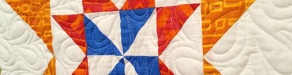
For my current project, the 28″ finished center block is expansive in itself. It doesn’t need to be expanded. The size, the diagonal lines, and the points all give it visual weight and an outward line. What it does need is more colors. If I don’t introduce new colors within the first border or two, they will look out of place if added later. The highest priority for new colors is the green-tinged-blue of the small flowers in the center patch, and orange. Orange is harder to see in that patch, hidden a bit amongst the pinks. But it is there and calls to be used. I can probably fit purple/lavender in at some point, too, once the color set is enlarged. Dark navy or black might work — we’ll see.
Wow, it’s a tall order to add a border of blue and orange, immediately after using bright yellow, strong pinks, and grassy green. A little subtlety is called for.

The orange has about the same intensity and slightly darker value as the center’s yellow, so it is a natural extension of it. The outward points and the color do, in fact, expand the center. However, the 4-patches on point create a bead of blues. That puts a stop to the eye, though it is not a hard stop.
The variety of blues automatically allows any of them or a bunch of others in later borders. I also repeat but vary the yellow and green of the center. Any time you’ve already used at least two versions of a color, you invite a third, and then you might as well have a party.
The corner blocks’ shape echoes the basic shape of the corners in the Carpenter’s Wheel block. Note that I added purple without it being an obviously new color. The corners also allow me to add flowers, repeating the motif of flowers in the center patch. Look also at how the 4-patches head to the corners. There isn’t a very good way to get them to turn corners gracefully. The corner blocks allow me to avoid that altogether.
Repeating elements provides unity, the sense that there is nothing out of place. Varying elements and adding new ones adds contrast and interest. This first border does its job of supporting the center block. It expands and then encloses it. It also both adds and repeats components, moving us toward an interesting and unified composition.
The next border will be an unpieced one. I can use it to correct the size, setting up the composition for another, more interesting border.

Pingback: Creative Juice #18 | ARHtistic License
So inspirational, I want to do a medallion too The color and design of your medallions are exquisite 🙂
Thanks, Tierney!
I’m enjoying the blue beaded edge, as my eyes were getting a bit weary of the pink and yellow. I haven’t made up my mind about the purple plaid in the lower right corner – it may be a titch too dark, depending on what follows. And where have you been hiding Stained Glass? I love the varied greens/blues in the outer checkerboard border.
Thanks, Joanna. I made Stained Glass almost 2 years ago — time flies! — and didn’t show it at the time, but I think I did later. I do think the checkerboard border is the prettiest part of it. As to the purple plaid in the corner, it is a little dark relative to the others, but I think that will come out in the wash (not literally.) So far this is all from stash (meaning, I haven’t purchased anything specifically from this project, though some of it is new fabric.) So I’m using what’s available. Thanks for comments. I always appreciate your eye for it.
The scale of the elements works together with the centre panel too; the medallion is the big flower, the on point 4 patches are the smaller flowers in the central print. Can’t wait to see what comes next!
Thanks much! Yes, I didn’t think of the scale of color in that way, but it may have been a subconscious decision. I make a lot of design decisions without knowing quite why, and justifying after the fact. 🙂
Yup, same here! The quilt ‘asks’ for something, and then we work out why later.
Nice to think this through with you. You are putting me in the mood to do a medallion–but I have a couple projects to finish before I dare start. 🙂
Boy I know how that goes! I have 7 donation projects waiting to be quilted, 2 of them made by me and 5 pieced by others. But I had motivation to work on this, and so there you go! (But maybe I can still get all that quilting done before the next guild meeting…)