I’ve been making progress on my current project. I made a bunch of flying geese, as described in this tutorial. They actually were the second attempt at that border. The first attempt was puss-in-the-corner blocks. I made 24 of them. They are not lovely. More importantly, they didn’t continue the clean, elegant look that the quilt was otherwise achieving. I never mind making extra blocks, for two reasons. First, sometimes you actually have to do something to know it’s the wrong thing; second, I almost always use extra blocks in other projects. I’ll use these in a VA hospital quilt, and they will be perfect there.
After making my flying geese, I called in my consultant (jim) to discuss the right arrangement of them. Should I use the light edges toward the center, or the dark edges? How should I treat the corners? Ultimately I decided to use the dark edges inside.
More borders are in process. Yesterday I made 40 hourglass blocks, and today I’ll work on 40 square-in-a-square blocks to alternate with them. Yes, that is 80 blocks in one border. Yes, medallion quilts can involve a lot of piecing. Fortunately, I believe this is the final pieced border on this quilt.


I like the dark against the the thin brown border instead of the light; just flows better. It also continues the eye outward from the blue and white pieced border. I’m at a loss as to what puss-in-the-corner blocks are, so I’ll have to look this one up…
Puss-in-the-corner blocks are what I’ve learned to call the uneven 9-patch. The way I make them, the center is 2x the width of the outside corners.
Ok. I’ll have to think on that one…
You can see the blocks in the newest blog post. I’m using them in a lap quilt.
Ok thanks. Will check it out.
My fav is the 4th border, with the step-like arrangement of squares! Looking good!
Those squares sure worked well. And easy, too! I’ll have to remember them another time. Thanks.
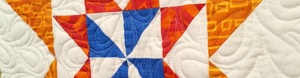
As a big fan of the color orange, I love how all the various blue hues throughout the quilt help the color orange really pop, from that beautiful square in the middle, to that quieter thin border line in the midst of the following layers, and then the echo of a suggestion of orange within the blue floral next to outer-most layer, just before the flying swans border. How the orange is vibrant in the center, and then more subdued the further you go out from the center.
I keep wanting to call it “Harvest Moonlight”. Obviously I know nothing about naming quilts, but can only speak to how it dredges up the idea of a bountiful harvest, as viewed in the dark blue moonlight of an autumn evening. Or something like that. Hey, I’ve already admitted elsewhere that I’m not a quilter, but rather, I’m just someone who appreciates artistic endeavors. Beautiful.
Harvest Moonlight, very pretty. I will certainly keep that in mind. All the blue certainly does give a moonlight effect.
THere is a lot of orange (the color is called “cheddar”) in the border I’m putting on now. Stay tuned…
That’s just so pretty!
Thanks!
I expect you’ve moved beyond the state shown in this post – hopefully just the one more border. My eyes enjoyed wandering the path in the one border, and the light colored squares help give an airiness to what could have been too heavy a border. I think you were right to have the dark part of the flying geese face the border rather than the edge. It helps reinforce the structure of that set of borders.
Thanks. Part of my reasoning also is that the next pieced border (nearly done making blocks…) has more light in it, so I wanted to keep the light together to make it more cohesive. I thought it would get too chopped up otherwise. Thanks for commenting.
I so agree about the light/dark placement–even without knowing more light was coming. I love borders that blend with one another, and this does.
We’ll see how it works out. I need to finish pressing the blocks (square in a square, stitch and flip method, last few to press and then trim out the corners underneath…) Then I’ll be able to tell for sure. Final border outside of it will be unpieced and will seem easy!! 🙂
We should invest in a ceiling mounted wide-angle GoPro camera to attach to the ceiling for these interim shots of your projects.
One more piece of equipment… 😉
Yes…maybe too much.
This is beautiful! Thanks for sharing!
You’re very welcome!
I particularly like the Irish Chain border – it seems that each time you post the latest iteration of this one, that is what my eye is automatically drawn to. Can’t wait to see the finished product, which looks (and sounds) like it is going to be soon 🙂
Soon…. Not sure! It still feels like there is a lot to do. Thanks for taking a look.
This is a really beautiful quilt. I like the way the squares dance throughout the design, and the borders are very nice!
Dancing! I wonder if you see that effect because of all the diagonal lines? Thanks for taking a look.
I think so — I see many sizes of squares, turning different directions, which makes me think of dancing. It’s very beautiful.
I can imagine dancers on the floor, the way you describe it. Thank you. 🙂
You’re welcome — thank you for sharing it. 🙂
I just love this one! Maybe it is all the blues and so on and of course how you have placed things–but it sure appeals to me. Bravo!
I’m really happy with it so far. When I compare it to others I’ve made of the same basic nature, I think it compares well. As I said to Jim, I think I’m finally getting the hang of this! Thanks.
I agree about the ‘getting the hang of this’.
You inspire me. I love medallion quilts.
Thank you — I do, too!
I love the double four patch border-it seems so classy for a four patch block!
I think it works well here. I can imagine it in more whimsical quilts using a lot of fabrics, rather than the one background blue plus lights. In that case it might not be “classy” but could be a lot of fun. Thanks.
I can’t get over how much this reminds me of Victorian encaustic tile floors. Perhaps not the effect you were hoping for, but there are some very beautiful examples out there, particularly in churches of the period. That small patch of sunlight heightens the effect by making it appear the surface is reflective..
I love tile flooring, so while that isn’t my intent, I take it as a compliment. So thanks!
Looking so good
thank you