Months after the challenge was issued, weeks after inspiration finally sparked, on Monday I finished my quilt in solids. None too soon, as the guild meeting was that evening.
The challenge required use of only solid fabrics (no prints, stripes, shot cottons, mottled hand-dyes, tone-on-tone, etc.) of at least three colors. Entered quilts must be finished, meaning they need to be three layers, quilted, bound, and labeled.
The guild has about 150 members, and about 20 quilts were entered in the contest. In size they ranged from about 18″ across to about 72″. In style they tended to “modern” or “art,” though all were quite different from each other. There was one big sampler, one expertly appliqued medallion, one “Aviatrix” medallion without the butterfly outer border, a couple of “twister” wall-hangings, a lovely art quilt on fading memories (one of my personal favorites). One member, Meredith, is a talented hand-quilter and entered two wonderful pieces. Both were in muted colors but different personalities, and her intricate work was beautifully integrated in the total designs.
Some of the quilts were designed by their makers. Others were modifications of other designs, and some were from patterns. Some of the quilts were quilted by their piecers/appliquers; others were not.
Our challenge is always a friendly affair with two winners. One is chosen by the judges, the committee that develops and issues the challenge, and one is chosen by the viewers. The range of designs would give an unbiased voter pause.
My quilt did not “win” in either category. However, I’m very pleased with it in general. I’d like do-overs on the quilting, in particular, but here are the positives:
- It is my design, my piecing, my quilting, my binding, my time, my tools, my love.
- The design is new for me, especially in terms of how I used space,
- yet it still looks and feels like me.
- I challenged myself to try new things on the top, the back, the label, and the quilting,
- and I met that challenge fearlessly.
- The design is successful in its unity, its balance,
- its color and value use,
- and its subtle asymmetries that keep it interesting.
- It is fun to look at.
- And it was fun to make,
- except the quilting, which wasn’t.

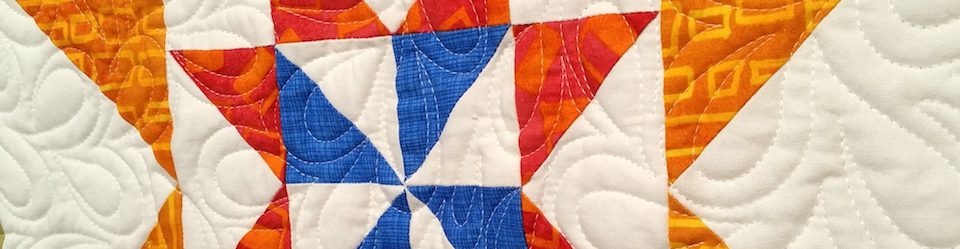
Branching Out. 45″ x 54″. Finished July 2015. Photo by Jim Ruebush.

Branching Out back. Photo by Jim Ruebush.

The label stitched into the binding. Photo by Jim Ruebush.

Yes, those hollow square and rectangle blocks can be tricky to piece and have them come out without the joins showing. Of couse I love this one with its bold solids and strong diagonals. It reminds me of a. Pendleton chief blanket. And the random seeming dots add another layer.
Beautiful quit Melanie and I like the varied colors in the flying geese. Trying something new has its rewards and it looks stunning. Great job.
Your interpretation of the theme (loose as it was (“solids”)) is wonderful, Melanie!
[Our guild challenge reveal is in September. I have an idea but that’s it so far.]
I think some challenges are easier than others. It took me many months to stumble on the inspiration for this. Once I started playing with the idea, the design came pretty easily. But then there was execution… Good luck on your challenge.
Beautiful quilt Melanie!
Thank you, Sandi.
I love it! I am always drawn to solids and so I guess I’d be pre-disposed to like a quilt like this. It kind of makes me think of a Pendleton blanket:
http://www.pendleton-usa.com/thumbnail/Blankets-Throws/Blankets/NATIVE-AMERICAN-INSPIRED/1694/c/1821/pc/2178.uts?currentIndex=32
This hit my spam folder and I just found it! I guess the filter didn’t like your link. But I do! Thanks very much, and for your patience.
WOW!
Thanks!
That is exceptional work Melanie! Just beautiful…
Thanks, Yanic. 🙂
I love this Melanie – both the front and the back. I think you should do some more exploring of new ideas, it helps keep us fresh and creative!
I love my medallions but my brain needs a break, too. This one helped, and I have a few other ideas in mind. Thanks for your support.
This is successful indeed! Love how you list new experiences and things learned, and that you used the word fearlessly – I could learn some of that as well as the other successes you list. Wonderful result – love the quilt.
I’ve been working on fearlessness pretty deliberately, so that part is a major win, regardless of anything else. One thing that helps is reminding myself that there rarely is any bad consequence of trying something. Even if I don’t like it, I can almost always fix it. Thanks for your comments.
It’s lovely – and still a medallion! I particularly like the colour choices and adjacencies, some of which are surprising to my eye but very successful. And that’s a GREAT back! Can’t see much wrong with the quilting… for me, it’s there to hold the layers together and add some interesting texture and I believe you’ve been quite successful there!
Yes, still a medallion. I probably feel a little too clever about that. 🙂 I was surprised at how well the colors turned out. There is red and orange-red and dark pink, all the same value and hard to discern as different in many cases. But they are, and I think that adds to the interest. I like the back, too, though I’ll admit it was more “trouble” to make than I expected. Thanks for taking a look and commenting.
Both the front and back of the quilt are beautiful! And the quilting is appropriate to the design, in my opinion 🙂
Hi, Mary. Thanks for taking a look and your nice comments.
Oh my gosh. The front and back are BOTH AWESOME! Very very creative, very modern.
Thanks, Kat. The back is intentionally “modern.” The front is accidentally that way. Thanks for stopping by.
I, too, really like your results. Well done and the analysis of your work will help you produce more I-like-my-quilt finishes in the future.
Thank you. I learn so much from the analysis, both midstream and after they’re done. Since I’ve been more thoughtful about the process, I think my quilt designs have gotten much stronger. Thanks again.
I love how the two sides complement each other! Did viewers get a chance to see the backs of the quilts too?
I also love the little dots of color scattered around the front. And, knowing how you have been working with medallion quilts, I appreciate how this was indeed “branching out” for you. And yet it fits in with your body of work, which I think of as “strong images with unexpected design details”. If I had to summarize.
Most of the quilts were hung so we could see both sides. Many of them were decorated on the back, too. The little dots were Jim’s idea, and as soon as he said it, I knew he was right. They really make it work, in my opinion.
Thanks very much for all your kind comments.
That is a beautiful quilt.
Thank you very much. And thanks for commenting.