
Cathie’s “Fantasy of the Squirrels” on the left. My “Garden Party” on the right. Click on the picture to open it larger in a new tab.
One of the things I love about quilting is how two quilters can interpret a pattern or an idea completely differently. The photo above shows two quilts made using the center panel designed by Julie Paschkis. My sister Cathie made the one on the left side of the picture. I made the one on the right. Frankly, I think they are both terrific.
If you click on the picture, you’ll see the details of both quilts better. With hers, I love the way the split-striped border creates movement with the light/dark bars’ contrasts. Those contrasts are offset by the soft brown on either side. The triangle points extend the center outward, giving it even more presence. The outside border is a leaf print of blues, greens, and black swirling through, continuing the “fantasy” of the center, and playing well with the green and black print that squares the center. She repeats both the reds and blacks from the center with the corner four-patches, adding to the unity of the design.
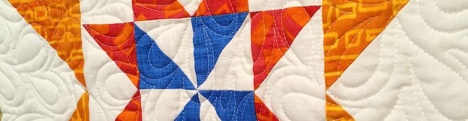
In mine the colors are more saturated, the value contrasts stronger. This is a typical difference of how she and I work.
I enjoyed seeing the finished quilts side by side.

It’s always fun to see how different people tackle a similar project. Our quilt guild does a mystery quilt project once in awhile, where the only thing that differs among the quilts is the initial fabric chosen. It’s fascinating to see how different the quilts look!
That would be fun to see. My guild does its challenge differently with pretty loose requirements. Last year’s was to use at least 3 solids to create the quilt. So there was a very wide range of finished projects. Also fun!
My guild has the mystery quilt AND another challenge quilt AND a block of the month quilt! Too many options to keep up with all and it’s hard to know which to choose!
I’m torn here. I like your sister’s striped inner border, but I love your trellis border. Maybe they could be combined through the magic of photo editing software. And I feel I would have used yet other colors and fabrics if I had that panel. Thanks for continuing to show how differently quilters can use the same fabric.
I expect every quilter would have a different interpretation, which is as it should be. That’s the reason I continue to resist writing patterns. I don’t want people to make MY quilt; I want them to make THEIR quilt. Thanks.
Gosh, all of these quilts are so lovely. I enjoy the detail in both of the Tree of Life quilts, and it is fascinating to see the variety in the pattern interpretation. 🙂
Thanks for stopping by today and commenting.
Both are beautiful quilts!
Thanks Sandi!
Wow, those really are different!
Aren’t they? Thanks for taking a look.
Interesting that you used the same middle but your use of saturated colour makes that middle seem darker than the other one. They are both very beautiful:))
I know, Lois, right? That’s one of the things I find most fascinating. And really hers was not faded out or bleached. They really are the same intensity. But they look so different.
How special to be able to share creativity with a sister. Do you collaborate with projects or prefer to share once quilts are completed?
We often consult with each other, but not on all projects. On these I don’t remember either of us checking with the other. Except as I was closing in on the end of mine, I did chew a couple of things over with her.
Both are beautiful quilts and yes. Your sister’s quilt has that softness to it. However, yours has the “punch” to it that I like…beautiful bold colors. It’s very interesting to watch individuals take a center panel, interpret a design and put their spin on it. I love using a panel or whole cloth for the center.
The softer colors of hers, as well as the broader borders, give it an openness that I think is very appealing. But I like mine, too, and the sense of looking into the garden through a flower-covered arbor.
It’s fun for me to see the way you went in different color directions which highlighted different aspects of the panel. In both quilts your precise quilting is a good counterpoint to the asymmetry of the center. Thanks for taking my panel to town.Twice!
Thanks, Julie. We both enjoyed working with it. (Mine also has your designs on the last border and on the back!) You are welcome to share if you’d like.
It is always interesting to see how different quilters work with similar designs, but a rare opportunity to see two quilters use the same center panel and same basic design concept yet end up with quilts with completely different feels. Great fun!
I know, isn’t that fun? I actually started mine a whole different way and set it aside, as it wasn’t working for me. In the meantime Cathie finished hers. I wondered if I’d end up being influenced by her design, since it is so pretty. But when I took mine apart and started again, it didn’t go that way at all. Thanks for taking a look.
Thanks for showing the comparison. I’ve really enjoyed following your blog and think I might be ready to go full-on for making a few medallion quilts myself. I especially love the concept of finding that special panel center piece to build around. You’ve inspired me Melanie!
Thanks very much. I’ve now made 4 quilts using essentially a “whole cloth” center. (One is actually still in process, but closing in on done.) This was the only one where the design was a panel rather than part of a large print. I’d be glad to do it again if I could find something that grabbed me. In fact, I think it’s good to be open to a lot of different centers. Hmmm…. I have a blog post on that. Maybe should dust it off…
🙂
Hers is a pretty, soft and feminine quilt. Yours has more flavour and punch. I prefer yours!
Thanks. I like them both, but differently. She usually goes for lower value contrast than I do, which gives the lovely soft look.
Very nice.
Aren’t they? Thanks for taking the picture! xoxoxo