Here is a quilt I finished last September but haven’t shown you yet. It is 60″ square and was inspired by colors of the American southwest.

Southwestern Sun. 60″ square. Finished September 2014. Photo by Jim Ruebush.
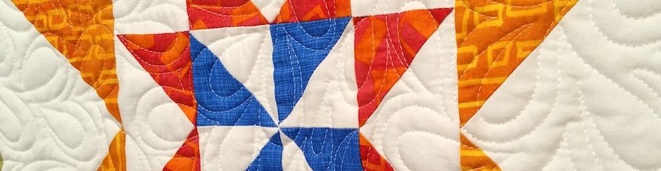
With bars, flying geese, and hourglasses, the construction was very simple. Even the center block is just a fancy nine-patch. The apparent complexity is from the use of color and value. For example, alternating light orange and dark rusty orange in the final border gives a sense of three-dimensionality. The geese in multiple directions provide a sense of movement.
In some of my medallions all the corners are different and only relate to their respective borders. In this one they are patterned, drawing the eye outward with the repetition, alternating plain rust squares and two other, more complex blocks. Repeating with alternating designs creates a rhythm.
Another thing to note is the use of multiple fabrics of the same colors. There are several of each light orange, rusty orange, dark green, lighter green, and blue. If you use at least two of any color, you have invited another and might as well use it. When you do, you make the quilt more interesting, because there is more to look at. All of the fabrics except the back were from my stash.
The colors are very strong, even for me. But the consistency of saturation actually calms the whole. Consider the DeLight quilt I showed you recently. Its saturated reds, oranges, and violets are offset by the grey background. Because of the contrast, DeLight appears (to me) to have a stronger palette.
The longer I have this quilt, the more I like it. I’d be happy to give it up to a loved one. In the meantime, I’m happy to have it here.

Absolutely lovely and it makes me want to go play in the sewing room! Amazing what you can ‘build’ from the inside going outward. I love the inspiration you give us. Thank you!
Thanks, Kathy.
My favorite part of this one is the blues, which are intense like a southwestern sky.
Agree. I think if the blues were not there, or not as balanced, it would suffer. Thanks for taking a look.
The intrinsic beauty and value of all art lies in the eye of the beholder. Often it’s not explainable. So it is with your southwestern masterpiece. Like an ear worm I can’t get out if my head, or eye candy that glues my eyes, I’ve returned to it several times. Each time I appreciate something different. Thanks for sharing.
Thank you, Jim. I’m glad you enjoy it.
This quilt is beautiful, too. I’m especially interested in the way the colors work together. I’ll bet that took some planning!
I didn’t plan this a lot. The focus print (in the very center and in one of the unpieced borders) provided the color set, though I didn’t use black elsewhere. Thank you.
Those colors really capture the southwestern vibe!
Thank you. The funny part of that is I made it *before* we went to New Mexico. 🙂
Very nice!
Thank you!