I finished climbing The Mountain.

The Mountain. 60″ square. November 2015. Made from stash. Photo by Jim Ruebush.
When I posted a photo of the top, I said that, aside from taking three different tries at the center block, it went together very quickly. One reason for that was I had already defined the border widths. When designing a medallion, there are infinite choices for border widths. Each possibility leads to other design decisions, including block size and the next border width. Because I was using a familiar blueprint, those decisions were minimized.
Two other decisions were made as I chose fabrics. First, I chose to use large patterns, and lots of them. Second, I chose to do minimal piecing. After all, if you use large prints and cut them into little pieces, you lose the impact of the print.
Working with constraints such as size simplifies some things, but it also forces a different kind of creativity than when there are more options. For example, having decided that the center block would be 15″, I needed to choose a design that would translate well to that size. A 9-patch format works easily; using a 5-grid (5×5 format) works, too. But a 7-grid, like a bear’s paw block, is harder to use. Deciding to use all large (or largish) prints meant figuring out how to use them effectively.
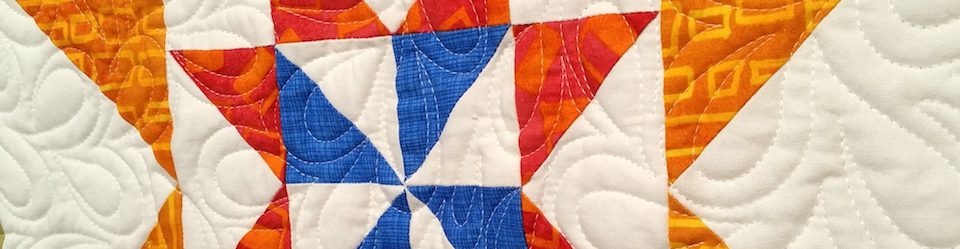
This quilt taught me more than you might guess. First, it showed me the power of large prints. When many of us started quilting, we learned that an effective combination of fabrics would include small prints, mid-sized prints, and large prints. (Back then we also were warned against using any solids, as they would read “flat.”) The combination, we were told, would provide sufficient contrast to keep the quilt interesting.
I often use small prints and tone-on-tones as the main type of fabric pattern in a quilt, but I’d never made one with all large prints. I wondered if mixing them would confuse the eye, but I found that didn’t have to happen. The key still is contrast. Using contrast in color and/or value separated the components sufficiently. While the outcome is a jumble, it is an organized jumble. The prints didn’t all mush into a big blob.
The importance of value contrast was reinforced to me, as mentioned above. One thing I like especially is the pairing of the lighter, peachier batik near the center with the darker, bronze batik in the outside half-square triangles. Both serve the same purpose in piecing, but using the darker triangles farther out emphasizes the last border and gives the eye a place to stop.
Value also plays its part in the three borders with light backgrounds. Nearest the center, you see the “sticks” split with red. (I really did split the sticks and insert the red, maintaining the positions of the lines.) The order is reversed two borders farther out, with the red split by arrows with light background. And the next border is a white-with-navy stripe, adding brightness to a quilt that could have bogged down in dreariness. All three of those borders give strong, graphic light/dark contrast, repeating the black with almost-white in the very center.
The third lesson was in piecing. My intention was to use minimal piecing for this quilt, regardless of the fabrics. Over time I’ve found that my tendency has been to increase complexity in my borders. At the same time, I know beautiful medallions can be made with little to no piecing within borders. So it was time to push back and simplify some. The big prints gave an even better excuse to do that.
I’ve been asked why I call this quilt “The Mountain.” It does not have pictures or representations of mountains on it. There are no wild animals, towering pines, or anything else. I am not sure why the name came to me, other than that I have been climbing and climbing, mentally and physically and emotionally and artistically, and now I feel like I’m finally getting somewhere, though of course I’ll never reach the peak.
I think these words of advice from Carina Devera are helpful when facing any mountain:
How to climb a mountain:
1. Don’t forget to pack your courage.
2. Do not presume a mountain can be climbed all at once; one step at a time is all you will be granted.
3. Faced with such permanence, take comfort in all that is fleeting, and dare not disturb the rocks.
I found her essay at On Being, one of my favorite sites. She concludes with “The mountain had taught me how to persist beyond all hope or expectation — a humbling lesson I will not forget.”
There are lessons to learn from all the quilts we make, all the relationships we strengthen or break, all the physical challenges we face. My mountain teaches me to have patience and perseverance, and to stop on my way to catch my breath, to appreciate my traveling companions, and to marvel at my surroundings.

Well Melanie, I do believe you’ve outdone yourself here. From the first time you posted a photo of the top, I loved the contrast between the black and white prints. Then the colors of the outside border act as a magnet, pulling all the contrasting prints together. From the time you first started your medallion quilts, you’ve come a long way and I too have learned much from your posts. The “Mountain” displays many different values of prints that alone, one would never think of putting them together, but somehow you did. Great job,
Thanks. That means a lot to me.
Lovely quilt
Thank you, Norma!
One aspect of your quilt design you didn’t mention was the role the dark blue bits play to extend your value range and warm up the blacks. The dark blue also bridges the colors between the circle fabric (with blue in it) and the blacks, and ties the outer border to the inner border with the same fabric. I especially like the way you grounded the outer border with the darker tan fabric. I suspect it looks ugly on its own, but it plays a great supporting role.
I was surprised at how important the dark blue was. I knew I “could” use it, since even the center block includes dark blue. I’m not sure I ever combined dark blue with black, so that made me hesitant. Still the more I used the better it got. (Lots of things are like that, aren’t they?)
That tan/bronze fabric — it was on the clearance shelf at the shop. I picked it up and showed it to a friend. “That looks like something I’d use, doesn’t it?” I remember asking her. I don’t use a lot of batiks, and I don’t use a lot of muddy colors. But it DID look like it would fit with things I make. She agreed. If I hadn’t bought it I probably wouldn’t even remember it now. So yes, it was a great find.
THanks.
Once again, thank you for sharing your climb to producing a finished quilt. I’ve learned a lot from the way you’ve used those large bold prints. Contrast certainly is central to how a patchwork pattern works – do you ever take a black and white photo to check contrast as you are creating?
I don’t do that while in process, Allison. I’ve certainly been fooled on the value, since color saturation can mimic it otherwise. But there are a variety of different elements we can use to create contrast and interest. Main thing is to hit at least one of them! A no-contrast quilt isn’t possible, is it? Even a wholecloth quilt from a solid fabric has the quilting relief and design to create contrast.
Hum! I suppose it’s when the contrast isn’t sufficient to keep a patchwork pattern visible across a quilt that problems can arise, unless the intention is to achieve a ‘smudgy’ look.
Yeah, you know me — I tend to prefer noticeable contrast on a variety of fronts. The famous low-volume quilts typically don’t grab me, though of course I’ve seen a few I think are quite beautiful.
I love that quilt! I really like the contrast not only within the strong black/white/red areas, but of their contrast with the more muted areas. And I love the way that in the corner blocks, the rectangles of that printed fabric fall where they may, they are not all arranged to be symmetrical. There is just so much visual richness here!
Thanks for taking a look and for your compliments. I’d like to take credit for the corner blocks as they are, but the only credit I can take is that I used the very last bits of it, so there was NONE to reposition in some other way. In fact on the outer set of corners, on the border with arrows, there is one unpieced corner. The other 3 are pieced up in little bits of the African orange, a weird green with cats, and ultimately, a different orange altogether on the last one. I used it ALL! One of many reasons I am so grateful for your kind gift. 🙂
The stuff that I sent you, I got at just a regular quilt store in Dallas – but at International Quilt Festival, I bought 6 fat quarters of cloth from Aftica; 3 of them are “wax cloth” which I haven’t heard of before. They are very muted patterns though – but we shall see if inspiration from you appears in one of my quilts in the future! 🙂
I hadn’t heard that term before, but it looks like it means “batiked” with a wax resist. I bought some FQ at the IQF Chicago in March — they are not muted!
https://en.wikipedia.org/wiki/African_waxprints
I like this quilt very much. You have achieved balance and harmony with a proliferation of strong prints – something that not many other people could – simply by imposing a rational and considered structure. It works beautifully. I still see pyramids marching around your borders, and for me, these are the mountains that explain the name!
Thank you, Kate. I like it, too. Recently I shared my version of an old folk tale, about an artist. It took him many years of practice to do something very simple. I’m getting there!
I saw that post; it struck a chord with me too.
I like the ⇔ arrows in the red border.
Yes, everyone says that. 🙂