In my prior post about proportion, I talked about center block size. The size of the design within the block affects the sense of proportion, as does the size of the block as compared to the whole quilt.
There are other factors besides size that affect proportion. The visual “weight” of design components also influences our perception of size, and therefore proportion. Weight refers to the ability of a component to attract attention. We want the center block to attract attention; it is a natural focal point, and should be in a medallion. But we don’t want it to attract attention to the detriment of all the other parts. The song “All About That Bass” annoys me because it isn’t. It’s about how the parts all work together to create a pleasing whole.
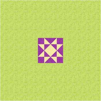
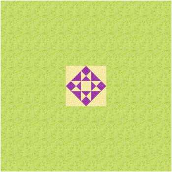
I used these illustrations last time, to discuss the size of the center as compared to the whole. They also exhibit the characteristic of relative weight. The first center block is 25% of the width of the whole quilt. The second, including the on-point setting corners, is just shy of that. The star design in each is the same, including colors.
To my eye, the top center block appears larger and “heavier” than the lower one. Why? First, the shapes within the star are 50% larger. Second, the pale setting triangles of the lower one give it less weight and presence.
Okay, there are two different things I mentioned. One is the size of the shapes within the block, and one is a color and/or value contrast issue. Let’s break them out separately.
First, the color and value: compare the first picture below with the middle. Then compare the bottom illustration with the middle.


 The first center block appears larger than the second one, though they are actually the same size. Why? Because the value contrast is greater. With its greater visual weight, it will appear to have a somewhat different proportion with the whole. Similarly, the third block using bright red has more weight, or draws attention more, than the bright purple.
Factors that increase our perception of visual weight include:
- Greater size
- Greater value contrast
- Greater color saturation (more vivid as compared to duller)
- Warmer color temperature (red is weighty as compared to blue)
- More pattern
- More compact or dense
For the last two, examples might help. First, more pattern is visually heavier than less. Consider two blocks of the same size and design, and generally the same colors. One is made from printed fabrics and one is made from solids. For most people, the block from prints will hold attention longer; thus it is considered to have more weight. Second, a more compact design is heavier than one that is less compact. For this, consider two objects. One is the puffball of a dandelion gone to seed. The other is a golf ball. Both are about the same size; both have textured “surfaces,” both are white. But the dense and compact golf ball is visually weightier. If you return to the two images at the top of the post, there is another example of the denser component having more weight. The top block appears denser within a similar space.
Next time: discussion of border width proportions.


I’ll respond here to your posts to date on proportion. Once you leave the realm of other people’s quilt patterns proportion looms large. You can go miniature or super size a block, you can go symmetrical or otherwise. As a companion to your discussion that focuses on medallion quilts I suggest Joen Wolfrom’s “Adventures in Design” book. She illustrates basic principles with copious photos of eye candy, and points out what makes a design work. It’s hard to go from theory to practice, so I always find examples helpful. And luckily you’re providing them.
I have that book and yes, it’s wonderful. So many great examples to illustrate her points. It would be great to have similar resources to share in posts. Thanks for reminding me it is on my shelf (actually now on the table in front of me…) 🙂
When I photograph or crop a photo, I intentionally try to get proportions of about 1.6:1. It always looks better to my eye. You are seeing much more than that here. You have color, shape, texture, etc.
The issue with these quilts — ONE issue — is somewhat different. First, there is the radial symmetry. So we aren’t usually looking at proportion the same way you would for a landscape or even a human body. Still there is a sense of it being pleasing, or not, for the arrangement of sizes. Very subjective. And yes the other factors also play into it, but they do too for a photo. You have the balance of weight — where is the tree, or the house, or the mountain. What is the color balance? Look at the photo of Tam on facebook and see her bright red blouse. Is the red in good proportion based on the other colors in the photo? 🙂
This is fascinating to me. Good drawing, painting and photography have concepts in common with quilting. Thanks for the enlightenment!
Very much so. It is a “thick” 2D medium. 🙂
My dad was from Iowa. I remember the grey-haired women of my early youth stitching quilts. Thank you for helping me understand what they were doing.
My pleasure. There is a lot about quilt history that makes us exactly the same. It’s nice to have that connection.
Yes indeed. I hope to meet you and Jim in person one day.
Our tentative trip to MD last month didn’t happen. When it does, we’ll be sure to let you know.
I am looking forward to it!
And that’s also why I spend so much time squinting and auditioning fabrics, and rejecting ones which ‘ought’ to be ok and just aren’t.
I get that. Hey, Kate, what time is it in your day? Did you just roll out of bed?
It’s 6.45am, and I’m actually sitting up in bed drinking the freshly brewed coffee the Husband has brought me, checking emails and looking at WordPress. My daily morning routine!
And it’s Thursday, right? 3:48pm on Wednesday here. Overcast and breezy, about 26 degrees C. 🙂
Yes, Thursday morning. Brilliant sunshine, warming up from an overnight low of 10C/50F. The forecast is for 23C/73F, very nice winter weather, perfect for yard work!
Now I understand why some Medallion quilts look either Great , or cluttered or unbalanced, Thank you for the posts
Oh my yes, and there’s a lot more information to come. Thanks for reading and commenting.