WIP: Work in process.
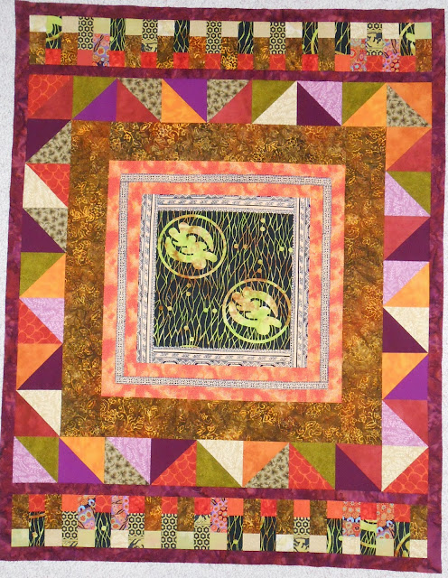
WIP currently about 38″ wide x 49″ tall.
This is NOT finished. Please comment. What do you like? What do you not like? What would you do as the next border for color? How much bigger would you make it in total? The outer squares in the top and bottom border are more green than they show on my screen. ALSO it is NOT square now. I can square it. OR I can keep it rectangular.
You may think you don’t know enough about quilting to answer, but instinctively you know enough about DESIGN to answer. Just give me your first impressions. It’s fine to be critical. Just don’t be mean. 🙂

What a wonderful way to frame an unusual ethnic-like print. I would also bring out the orangy salmon, lime, and winey purple, especially the mottled fabric in the second and fourth border and echo the round feeling from the graphic and small dots in the background of the medallion. Would a scalloped border fulfil that?
I hadn’t thought of a scalloped border and it’s an interesting idea. I do think I need to find a way to incorporate the circle motif from the center somehow. Last night I was thinking about painting fabric. Stash I currently have doesn’t quite work, anyway. But if I painted something…. it’s possible.
Thanks for taking a look!
Have you seen the quilt block pattern called pickup sticks? I found a tutorial here: http://paulsblockparty.blogspot.com/2011/04/pickup-sticks-quilt-tutorial.html
I think doing that using a black background and gold fabric to echo the colors in the center medallion would look awesome for another border…and maybe throw in the salmon, green and purple in a few of the sticks too. You could make the border as large or as small as you would like, making the sticks as numerous or few as you like…and they can be skinny or chunky!! I’m looking forward to seeing what you do with this beauty!
Hi — this got thrown in spam by mistake! Can’t think why but I’m glad I finally saw it. Thanks for the ideas for that last border. I still haven’t decided for sure what to do. One thing I did try wasn’t going to work out. The regularity and squareness of everything kind of imposes the same for the last border. My idea was very off-square and it looked bad! I’ll post a picture when I get it done. THanks again!
Have you considered echoing the asymmetrical effect of the inner circles by adding additional borders on just two sides? This fabric is so non traditional that you might try an unusual setting with it – like an off center medallion. I love the use of the blue(?) fabric in the piano keys as it tones down the salmon/purple colors. One further comment – I not sure about the mottled fabric used after the first narrow border and between the next narrow border. The color just doesn’t enhance that wonderful center fabric.
Thanks for your comments. One thing I’ve found is my computer screen has a hard time showing true colors. There isn’t any blue in the piano keys, so I’m not very sure what color you’re seeing that way. I will keep the rectangular shape. For adding borders on just 2 sides, do you mean, for instance, just top and right? That’s an interesting idea. Will think about that.
I like it! I would add a small black border all around it now to pull that black in the center outward which also reinforces the black in the previous “bars” or piano keys border. Just an idea? Enjoy!
Thanks, Kathy! I did put black all the way around, a narrow border, just as you say. And it helps reinforce the center black and anchor the whole thing. I woke up this morning and had an idea for the final border that may work. But I need more/different fabric! So this will wait for a while.
Melanie – well here goes. To me I wouldn’t square it up as I like the rectangle presentation. I never thought of doing piano keys like you did, but I really like it and I think it adds to the overall design. If it were me, I’d add one additional border possibly using a violet purple with a gold tone on tone type design. That would pull the gold from center out to edges. That’s just my take on it for what it’s worth! Turned out real pretty…
Thanks. I like the rectangle, too. I am not usually struck so strongly that I should leave it as is, but when I got that far, I didn’t want to square it. Today I framed it with cream-on-black African mud cloth, just a narrow border. Then tried something that didn’t work. I’m going to put it away for a while. I don’t have the right pieces to finish it, and don’t feel like shopping now. (Need to be in the mood, unlike a lot of other quilters!) So on to the next project!! Thanks for your comments.
Like this https://www.etsy.com/listing/157551485/purple-gold-wax-african-print-fabric-per
I know you’ve enjoyed working with the ethnic fabrics.
Yes, I have enjoyed the ethnic fabrics. Takes me in whole new directions. That purple fabric is fabulous! I’m not sure what would be available around here. Maybe the shop in Kalona…
Hey, there, as always I’m eager to put in my two cents on medallion rounds! First reactions are, you would expect me to say, square it up by adding sides, possibly bring out the purple, a single print of a big rich purple but less clear than the bright violet in the hsts (duller) with some pattern of circles to echo the center motif, contrast with the hsts.
Circles… usually I deliberately echo like that but have not done so here. Will look at the possibilities for that. Not much in my stash that suits this piece right now… 🙂
Your quilt feels like long, golden grass flowing in the wind to me. Very peaceful. What do the symbols mean in the middle? I would go for rectangle. I would not feel the need to square it. And honestly if you hadn’t told me it was unfinished, I would have thought it was ready for binding. Could you not leave it be? I like the purple on the outside.
I wish I knew what the symbols mean! It makes me a little uneasy, like using “American” hand gestures in a foreign country. Did I just say something incredibly rude? 🙂 I think the rectangle is right, but it is not done yet. Still considering my options… Thanks for taking the time to answer.
Then if I was to add a border, I would go dark. Just to keep the eye on the center.
Do you know the name of the fabric collection or who designed it? Maybe we could find the info to the meaning. 🙂
No, it was a piece I got as a door prize or in an auction bundle. No identifiers left on it. Good idea, though!